The ETA-Station project has now entered its Phase 2, improvements and iterations. As mentioned in the “First Look” post, after the initial manual build, one of the planned steps was re-creating the ETA-Station in Studio so I could experiment with different colours, etc.
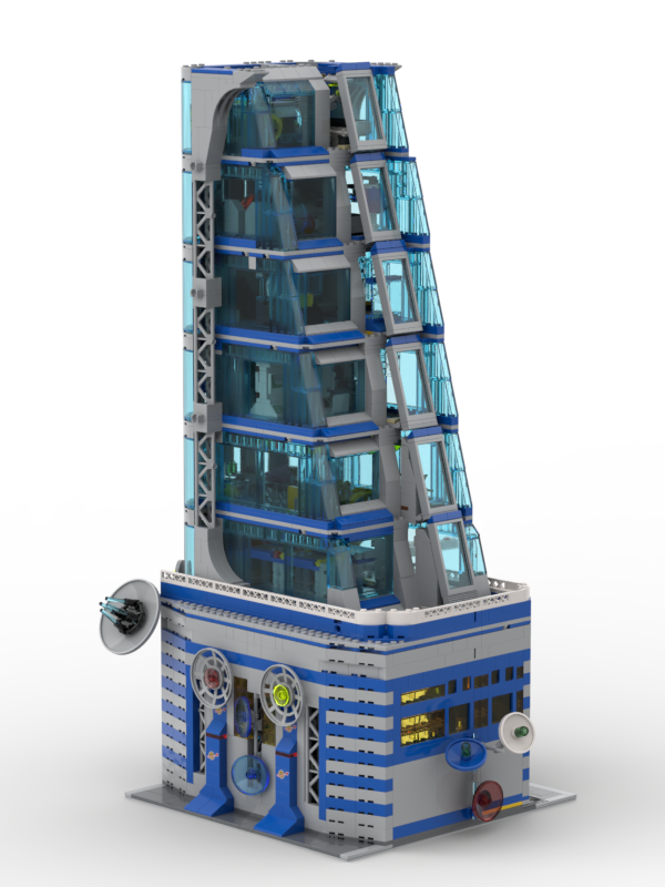
This re-creation step has been finished, and as you can see, already some changes have been introduced in the design:
During building the digital model, I became more and more unsatisfied with two aspects of the physical build:
- I did not like the outer cover with the large dark grey windows as this really took away the “Classic Space” feeling by having this massive dark grey area.
- The thin side supports are not very durable and are shaky when it comes to adding the top floor.
Thus, while building the digital model, I decided to address those issues. The most challenging one was the replacement for the outer wall approach. Initially, I considered a different outer wall design, e.g. a design with light grey windows like the LEGO Tower. But as I had not really the parts for such an approach, it would have turned into a massive cost to recreate the small window design from the LEGO Avengers Tower with small light grey windows:
I decided to deviate from the original design and consider the implications of removing these outer walls. This would essentially mean one side of the building would be open, as it was previously covered or closed by the outer wall.
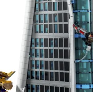
Initially, I devised a method to close the wider side. This involved using the trans-light blue 1x5x6 panels, which are also used for the side wall, to close the front. Additionally, I incorporated the incline of the front by adding slopes above and below these panels.
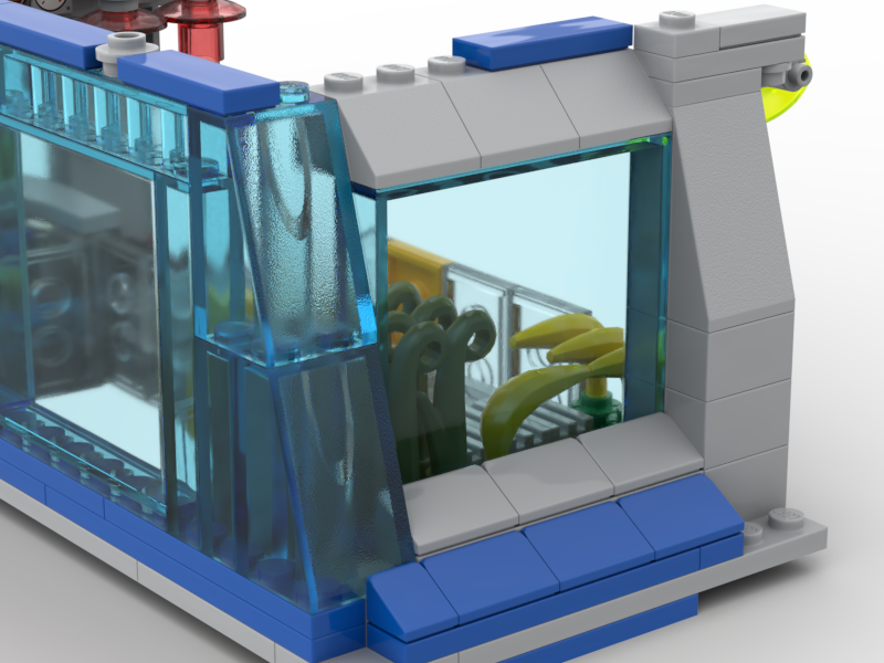
The 1x5x6 panel is recessed, with smaller slopes for the bottom and the classical 2×2 45-degree slope on top. This creates the slope to cover the length difference between each floor.
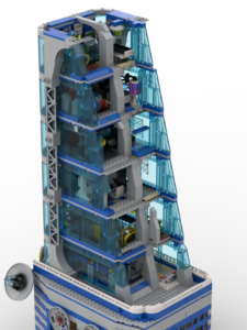
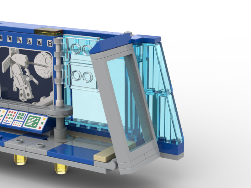
The smaller side was more challenging, and I wanted somehow to keep the inclined facade from the original tower. After some trials, I ended up with a design where I would put on each floor the 1x5x4 window frame and trans-light blue glass and put this on hinges to create the incline:
On each floor, the window frame is put in hinges, and the top is completed with plates and slopes to close the gap to the next floor.
After having resolved this to my satisfaction, I looked at the side supports and the lack of stability those provided to hold the heavy top. When I disassembled and assembled the tower by unstacking/stacking the floors, the side support always fell apart and did not really provide any support to the heavy top. Also, the bricks were not really showing too much clutch power, so the overall side pieces have been extremely flaky. And I noticed the height has been a bit off, either 1/2 plate height too low or too high, somehow a mismatch in size over that many layers.
The solution was already in my head, and after a kick check on the real-world model, I went for a design with the support stance, thus also moving from a 1-stud-wide support area to a 2-stud-wide support area for the top floors. The additional 1 stud I earned as I no longer needed the space for the outer frame. This design has to be proven (also later) to be really stable and looked also much nicer (I think) compared to the simple grey stones.
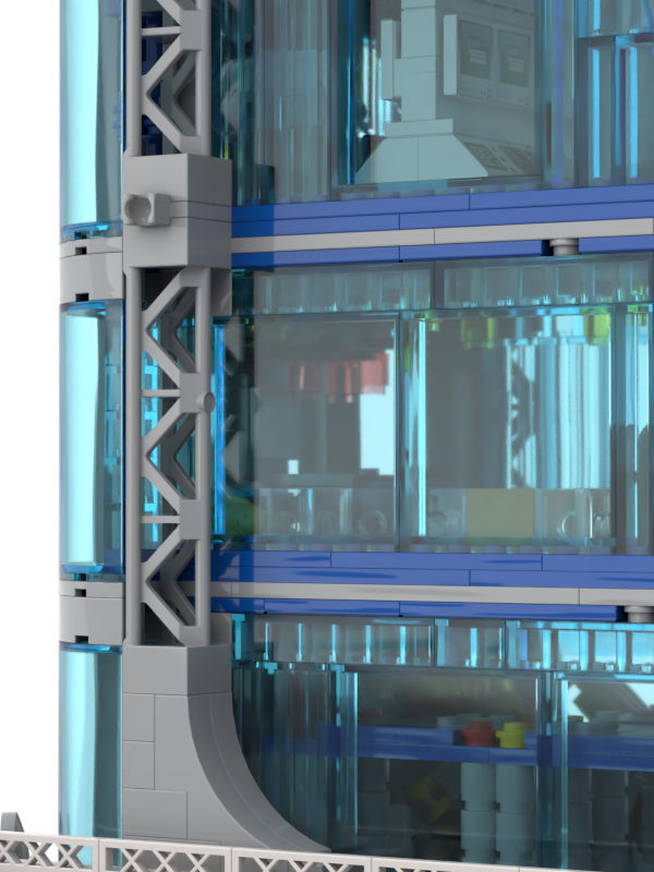
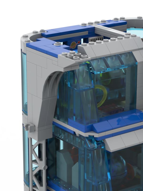
Another change I made was to the top section of the support. I now used tiles to connect it, which helps the side support with the upper floor walls. This provides greater stability before we stack the top floors. In the original design and Hero Tower, the side supports only connected at the top with the bottom of the top floors. Consequently, once the top floors were removed, the supports became very unstable. This was particularly frustrating when attempting to stack the top floors, as the side supports kept falling. The new design promised much greater stability.
Beyond these significant changes, I also made smaller incremental improvements. I built the digital version based on the real build but noticed minor issues or made adjustments, such as using different bricks, selecting tile colours and making slight changes to the interior layouts. It was a bit of a back-and-forth between the digital build and the real bricks, like recreating the design and experimenting with colours in the digital world before applying them in real life.
As you can see in the pictures, the top floor and roof are missing in the digital version. I decided to wait before recreating them, as they are more complex and time-consuming. I wanted to implement and demonstrate the major changes I mentioned earlier and assemble the entire tower to assess its overall appearance. This leads to Phase III – The Completion of the Tower.